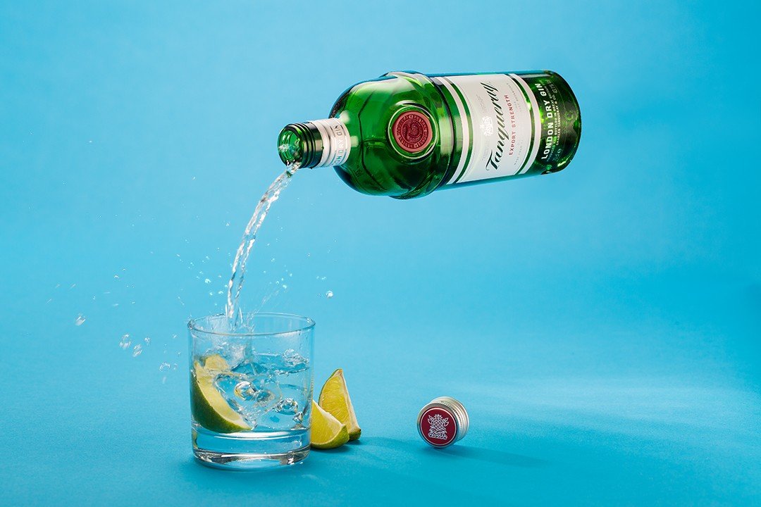
Making a levitating bottle in Photoshop is easier than you might think. This image used a number of techniques from frequency separation and dodging and burning to learn masks and adjustment layers but all that’s required to make the bottle float is a decent understanding of layer masks.
In the video below I walk through all of the layers that make up this levitating bottle image so you can see exactly how it is all put together. In this article, I’ll be going into a little bit more detail about what’s involved and breaking down some of the individual layers to discuss the techniques that I used.
Levitating Bottle in Photoshop Layer Walkthrough
Step 1 – Preparing to shoot
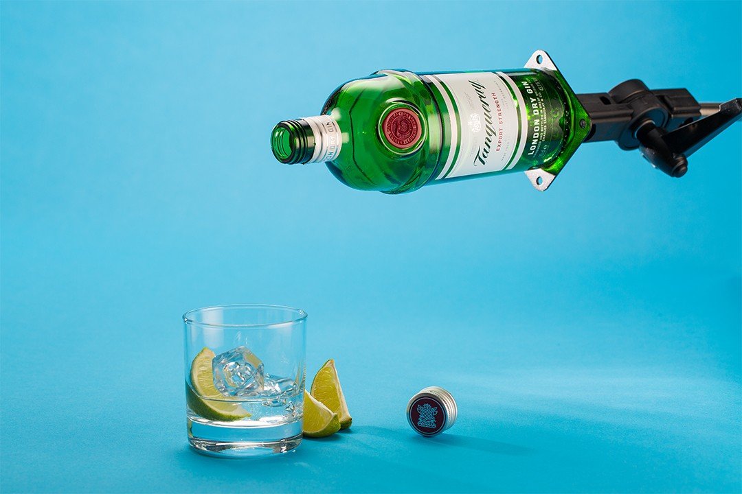
That is no behind-the-scenes footage from this video but the preparation was relatively simple. The levitating bottle is the hero of the image although I set this up as an experiment to see what could be achieved in terms of freezing motion with my current studio strobes. The bottle was suspended by glueing it with a hot glue gun to a baby plate fixed to the end of a C-Stand boom arm. It is lit using Godox SK300ii strobes firing through sheets of tracing paper for diffusion purposes. There is a main light positioned above the subject inside a soft lighter (a large reflective umbrella with diffusion material stretched across the opening). The soft lighter is positioned about 12 inches above a roll of diffusion material and forms our main light for the image. There is a second strobe to the right-hand side of the frame inside a small softbox which also fires into a roll of tracing paper and gives us the gradated light which runs down the side of the bottle.

The fruit and bottle cap in this image are very dull and lifeless. If I had set up bounce cards to reflect light back onto them, they would have just been wiped out by the splashes that were inevitably caused by the pouring of the “gin” and since this was always going to end up as a composite image I was happy to shoot a number of a Shots with mirrored bounce cards and composite them together for a better overall balance of light in the image.

Step 2 – Masking out the boom arm
Once we have the image looking acceptable it’s time to remove the boom arm. It’s important to always work nondestructively in Photoshop so I used a layer mask as opposed to erasing any pixels from the layer. Working with layer masks gives you the option to go back at a later date and edit your work, refining the mask as you go. The mask was put together using the pen tool, (formerly my least favourite tool in Photoshop). Recently I spent some time levelling up my ability with the pen tool and now it is easily my favourite method for making selections and masking out layers.
Initially, the background was inserted using Photoshop’s content-aware fill tool but on this occasion, it did a pretty poor job. It’s not uncommon for content-aware fill to fail dramatically even with the new interface that gives much more control over where Photoshop samples from to generate the new pixel information. Content-aware fill is a fantastic tool and a real game-changer for composite work but it’s unrealistic to expect it to come up trumps in every situation and it’s important to have a couple of tricks up your sleeve fix things when it fails.
When working with seamless backgrounds, savage paper rolls, and other solid colours, you can easily blend in the transition between Photoshop’s attempt at content aware fill and the original pixels using the mixer brush. The mixer brush is a firm favourite amongst composite artists as it is infinitely useful for blending transitions between different colours and preventing colour shifts between edits across different layers.
Now that the boom arm has been removed, we have officially achieved our levitating bottle in photo shop but there is more to be done. From here, I had to shoot around 150 individual pours and then choose the best candidates for selection before loading them in to individual layers in Photoshop.

Step 3 – Pouring the “Gin”
It’s water really!
I would never waste this much gin and altogether I poured around 5 litres of gin into this class, onto the tabletop and all over the floor of the studio. The boom arm is securely attached to a century stand allowing the bottle to maintain the same position as it moves in front of the camera. By pivoting the boom arm into an upright position, I was able to pour water into the bottle. Once the bottle was full, I dropped the boom arm which fell against a wooden stopper I erected in order to position the bottle at approximately the same height for each exposure.
I was able to capture around five or six decent pours from every refill of the bottle. I triggered my camera using Yongnuo radio triggers and monitored the results on my laptop which was tethered to my camera. I always shoot tethered whenever possible but on this occasion it was a necessity. It was really important to be able to view the results from each port in order to adjust the angle and velocity of the action for each shot.
Working with water and splashes is a learning process that requires a certain amount of luck, a certain amount of judgement and a huge amount of persistence. The general rule of thumb is to shoot as many splashes as you possibly can in the time that you have while aiming to finesse and refine the outcome of each pour. The chances are that none of them will be perfect but you have all can maximise your chances of getting the result you want by shooting as many splashes as possible
Once I had selected my favourite poor images and splashes, I simply loaded them all into layers in my Photoshop document. By adding quick and dirty masks around the splashes I was able to quickly eliminate those images that did not work and select a couple of favourites to use in my levitating bottle image. Having made a selection, the masks were drawn by on hand using a Wacom Intuos tablet and pen. Each splash had a levels adjustment layer and a hue and saturation adjustment layer added to make sure that the brightness and saturation matched the overall image.

Step 4 – Finishing Touches
The final image then had some frequency separation applied to clean up the bottle surface, some colour correction and a field blur to add some additional depth of field to the bottle. I added a gradient adjustment layer and masked it in behind the bottle and the pour to give a little more separation to the subject and finished the image with my usual finishing moves; sharpening, colour contrast, curves adjustments and a levels refinement.
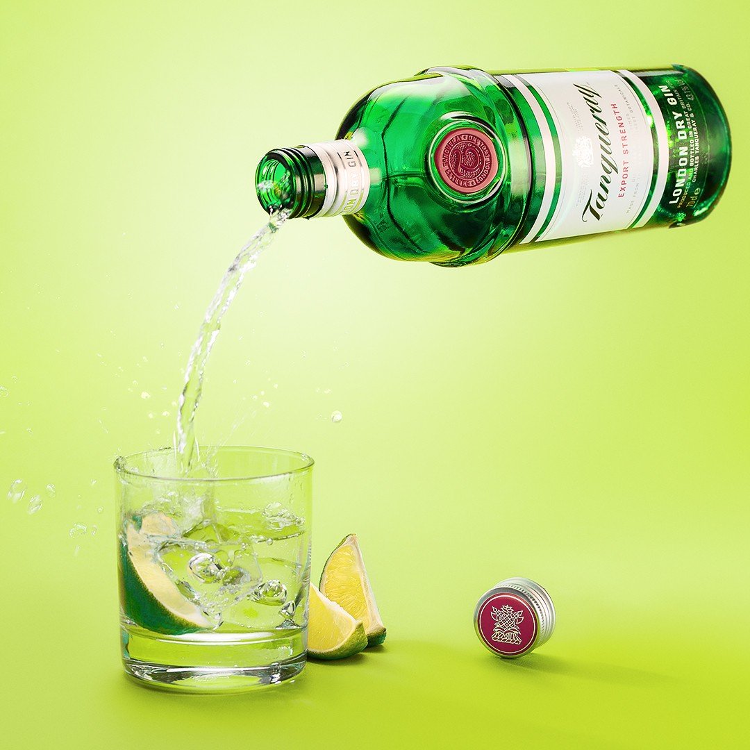
During the colour correction, I took the time to experiment a little with hue and saturation levels applied to the background. By selecting the blue shades in the image and altering the Hugh I was able to adjust the colour of the paper that I had used for my background. Initially, I had planned the image to be a vibrant lime green colour but the blue had been growing on me during the edit. I fiddled around with the colour balance and came up with three potential edits before deciding to feature all of them on my Instagram feed and keep the blue for my online portfolio.


